Using the Page Builder
,If you don't have an external website and want to build a site for your business, or would simply like a dedicated site for your learning platform, we've got you covered. With the Academy of Mine Page Builder, your website page creation options are limitless! Your platform includes a front-end website where students can browse and buy courses using our eCommerce tool. You can also add marketing or content pages to suit your needs. Our simple page builder makes it easy to create whatever type of page you want.
This article will walk you through creating a new site page and adding your content. Let's get started!
In this article:
- Page Builder overview
- Creating and Building a Page
- Restricting User Access
- Editing a Page
- Using Layouts
- Using Blocks
- Adding Page Scripts and Styles
Page Builder Overview
First, let's go over what structures a page's content: sections, rows, and blocks.
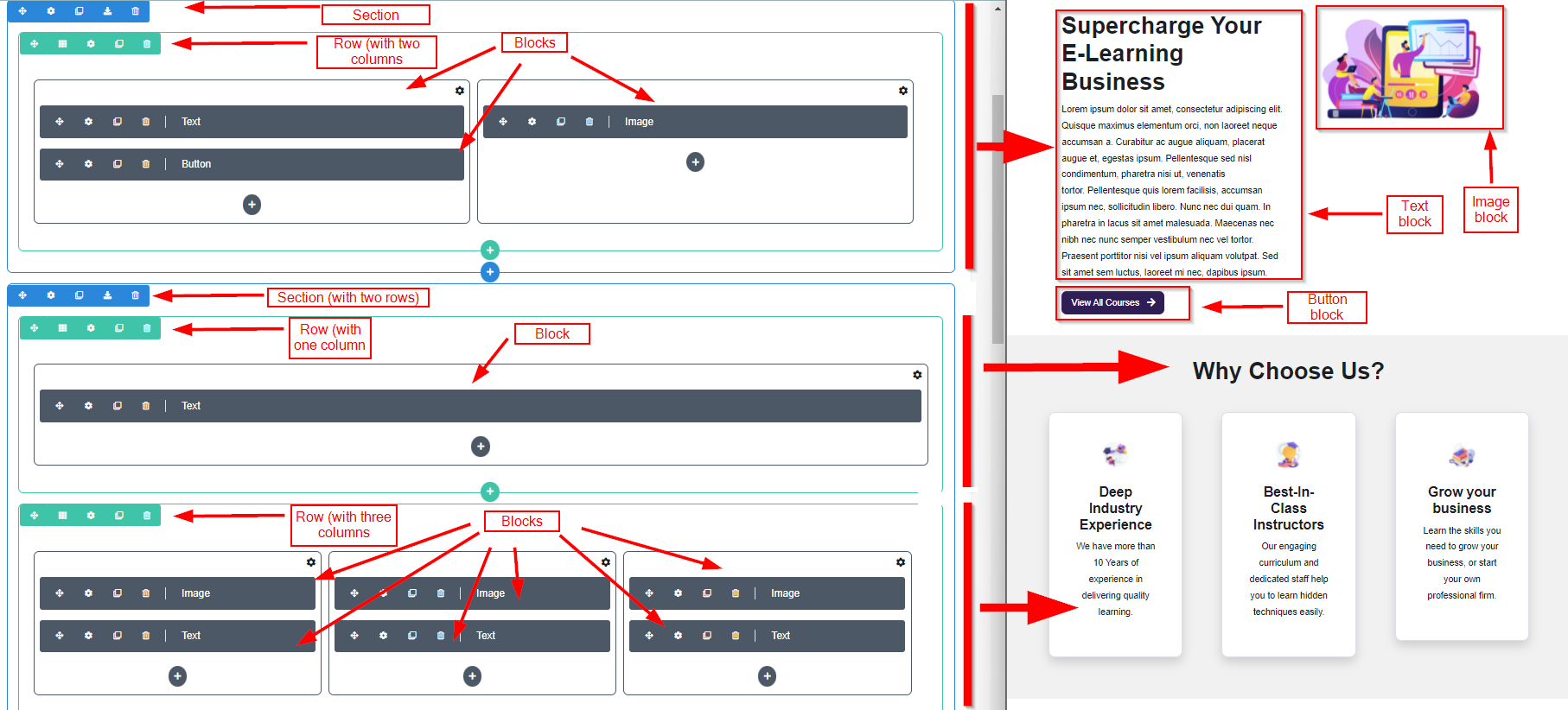
- Sections: Each page contains at least one section (the blue boxes) to hold your rows and blocks. Each section will have its own purpose, so think about what sort of sections you'd like your content divided up into on your page.
- Rows: We use rows (the green boxes) to further organize content within a section. Rows are powerful as unlike sections, they can be broken into columns and you can choose what layout you want to use. There can be multiple rows in each section.
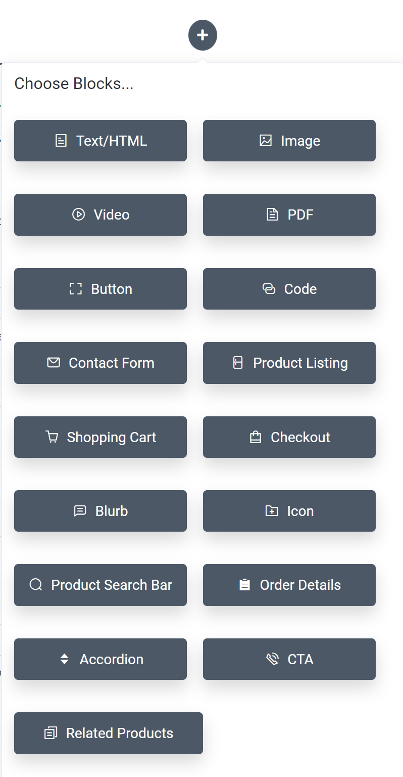
- Blocks: Blocks (the grey boxes) are how you add content to the page! We have several different block types available: you can add Text/HTML, Image, Video, PDF, Button, Code, Contact Form, Product Listing, Shopping Cart and Checkout.
In the screenshot below, you can see the sections, rows, and blocks in the page builder on the left. Then, on the right, we can see how those structures become the page on your site! In the example below we can see how different rows are used. The first section contains a row with two columns and three blocks. The second section contains two rows (one with one column, and one with three columns). Then each of those rows contains blocks of content.
Now, let's go through what each area of the page builder is for:
- The title is the title of the page.
- The Page Layout has three options:
- Full Width – This kind of page takes up the entire width of the screen.
- Fixed Width with Left/Right Margin Gaps – This Page Layout Type is the same as the Full Width but there is a gap on each side of the page.
- Page With No Headers – This page layout type is full-width and without a header.
- The Content is where our page-building magic happens--this is where you will add your text, images, videos, buttons, and more dynamic blocks like Product Listing and the Contact Form.
- The SEO Title is the title that should show up on the search engine for this website. This should be a unique identifier under 60 characters.
- The SEO Description is a short text that describes the webpage to search engines. Your SEO Description should be between 50-160 characters and should include keywords to boost your recognition by search engines.
- The Thumbnail Image URL is an image that’s associated with the webpage and is displayed whenever your page URL is shared on social media platforms like Facebook or Twitter.
We're now ready to start building our page!
Creating and Building a Page
Now that we understand what the parts of the page are, we can create and build the page using the steps below.
- From the AOM Dashboard, select the Pages & Menus tab and choose Pages
- Click “Create Page” button located in the top right corner
- We offer several page layouts that you can use if you don't want to build your page from scratch--click "Layouts" to select a layout, or you can continue to the next step to create a page from the ground up. You can also create your own layouts if you'd like to create and use a specific layout on more than one page. Click here for more information.
- Add the necessary sections for your page. Remember, you'll want to add a section for each main purpose of your page. You can add new sections or import a saved section by clicking the blue "+" button as seen below.

- Add rows to each section via the green + button. This is how you decide how you want your blocks of content laid out--for instance, do you want one column of content in a row, or multiple? You can also have more than one row in a section.
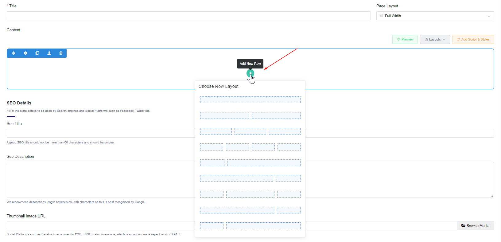
- Add blocks to each row by clicking the grey + button. Then, select what sort of block you want to add from the options below. Please also note that rows can have multiple blocks!
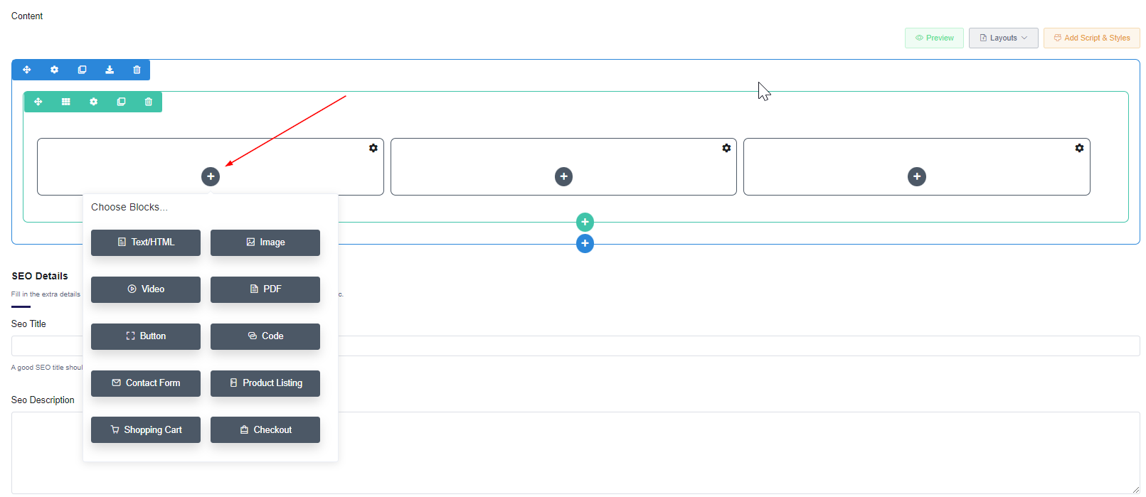
As you can see, there are several different types of blocks, and you can choose the one that applies to the content you're wanting to add--choose Text/HTML if you're wanting to add text, Image to add a picture to that block, etc.
The Contact Form, Product Listing, Shopping Cart and Checkout block serve a very special purpose for certain pages on your platform website. They are dynamic fields that will display the information on your Course Catalog, Cart, Checkout page that syncs with Academy of Mine's eCommerce features so that clients can view your products and go through checkout. They'll also be able to message you via the Contact Form if you add that block to a page.
The Course Catalog page you create must contain the Product Listing block, the Cart page you create must contain the Shopping Cart block, and the Checkout page you create must contain the Checkout block.
-
To add or edit the content within a block, click the Settings gear icon or simply double-click the solid gray rectangle. Enter your content, and click Save Changes.
- Further customize the block by clicking the Design tab after entering your content on the Content tab. Here, you can adjust spacing, alignment and borders. Or, click the Advanced tab to add a custom class.
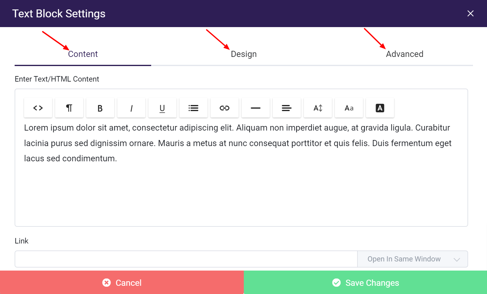
- You are welcome to add custom HTML to your page. At any point, you can switch the page builder from text view to HTML view. This can be done by selecting the HTML option
(<>)from the Content menu. - On the content menu, the ¶ icon will allow you to format the element you have selected, and you can also bold, italicize, underline, add bullets/number as well as change the font, font color and size
- Hint: after saving your block content, you can duplicate the block by clicking the Clone Block button (double square icon)
-
You also have the option to add custom script and styles to your page if you'd like! Click Add Script & Styles to add page-specific CSS, and save when you're done. For more information on custom styling, click here or continue reading
-
Add in SEO Details and a thumbnail image URL for the page as well if you'd like.
-
Edit the Slug if you want to--this is the URL for your page. The default slug is pulled from the page title, though you can edit by clicking Edit and entering the preferred wording. Keep in mind, there are a few slugs that won't work as they conflict with folders that we have for special purposes, so please ensure that your slug is not the just following: fonts, css, storage, resources, apidocs, images, and js.
-
To see how things will look on your site, click the "Preview" button in the upper right corner at any time.
-
Be sure to click Save Page when you're done to save the page!
Now that your platform website page is created, you can add it to a menu, and customize the navigation menus that will be displayed on your site. To learn more about navigation menus, please follow our guide: Customizing Navigation Menus
Restricting User Access
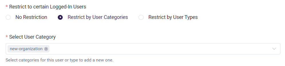
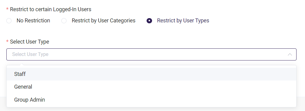
You can determine which users are able to see a page based on their User Category, User Type, or if a user is logged in.
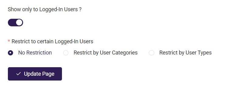
Show only to Logged-In Users?: The page will only be accessible to registered users who are currently logged in to your platform.
No Restriction: All logged-in users are able to access the page.
Restrict by User Categories: Only users who have been assigned the same User categories can view the page.
Restrict by User Types: Only the selected User Types can view this page.
Editing a page
Making edits to an existing page is simple. Check it out:
- From the AOM Dashboard, select the Pages & Menus tab and choose Pages.
- Click on the page you'd like to edit.
- Click Settings (gear icon) on the block that contains the content you would like to update.
- Edit the desired content, and hit Save Changes.
- Click Update Page to save the changes made to the page.
Using Layouts
There are some pre-configured page layouts available for you to choose from, such as a Product Listing or About Page, and you can even create and save your own custom layouts as well! Creating a custom layout is a great way to duplicate a page you've already set up--for instance, if you have created a page layout that you'd like to use again and just want to change up the text or images.
To create your own layout page:
- From the Pages & Menus tab, choose Pages and click on the page you want to save as a layout.
- Click the Layouts button and choose Save Layout--enter a name, and Save.
To use an Academy of Mine template or one that you have created:
- From the AOM Dashboard, select the Pages & Menus tab and choose Pages.
- Click Create Page to add a new page.
- Click Layouts and choose Load Layout.
- Choose either AOM Library (to use one of our templates) or Your Library (to use one of your custom saved layouts page).
- Select the layout you want to use.
- From there, you can click the Settings gear on each block and make the necessary changes! Be sure to save the page when you're done.
Using Blocks��
AOM uses Blocks to easily add different types of content and functionality to your LMS. Blocks are available within the Page Builder and the Text/HTML Modules.
Creating a block in a page or within a Text/HTML module is simple:
-
Inside a Row, select the Add New Block button
-
Select the type of Block you want to add
Please note that not all blocks are available in Text/HTML Modules
All blocks have the same three tabs you’ll find in other parts of the Page Builder; Content, Design, and Advanced. Design and Advanced have the same functionality across all blocks, with the exception that some Design tabs have a Width% slider. Content tabs differ based on the type of block you have selected.
Design Tab
The Design tab provides you with options to style your content, which includes Spacing, Width, Alignment, and Border.
Spacing consists of Margin and Padding.
- Margin is the whitespace outside of a piece of content, or the spacing between this piece of content and the others around it
- Padding is the whitespace between your content and the Border (See Border for more information)
- Both Margin and Padding values can be set using pixels (px), which will be fixed values, or a percentage (%), which will change relative to the size of this content and other elements of your page.
Width determines how much space your content takes up within a Block. The percentage is related to how large the Block is on your page, which is determined by the Row Layout you originally selected for the Section.
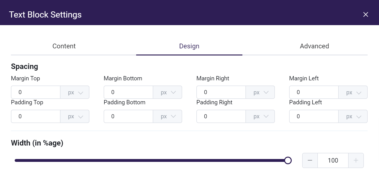
Width slider
Alignment is just like how you use it in a word processor and will align your content within a Block based off of your choice.
Border gives you the option of adding a border and styling it.
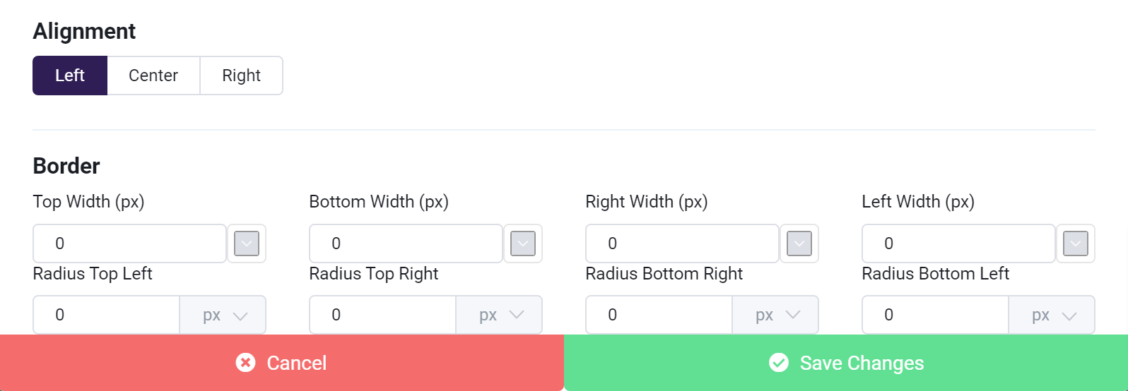
- Border Width values determine the thickness of the border, which edges of your content it appears on, and include a color picker to the right of each value.
- Radius values determine the curvature of a border around content and can be set with pixels or percentages.
- Padding values will change how far away your content is from the edges of the border (See Spacing for more information)
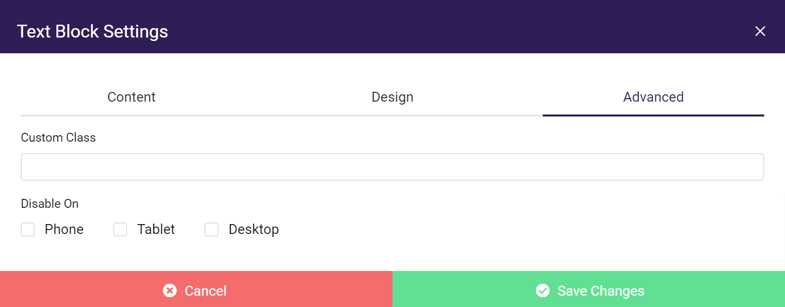
Advanced Tab
The Advanced tab gives you the option of creating a “Custom Class” for a Block. This can be used to target your content within the Add Script & Styles option.
“Disable On” allows you to disable a Block depending on the size of the screen it is being viewed on.
Now that you understand the Design and Advanced tabs we can get into the specifics of each Block type’s Content tabs.
Block Types and Content Tabs
The Content tab is what makes each Block unique and provides its specific functionality. Let's dive in!
- Text/HTML Block
- Image Block
- Video Block
- PDF Block
- Button Block
- Code Block
- Page Builder Specific Blocks
Text/HTML Block
The Text/HTML block lets you add and edit text, create internal and external links, download links, and insert HTML code directly into your Page or Text/HTML Module.
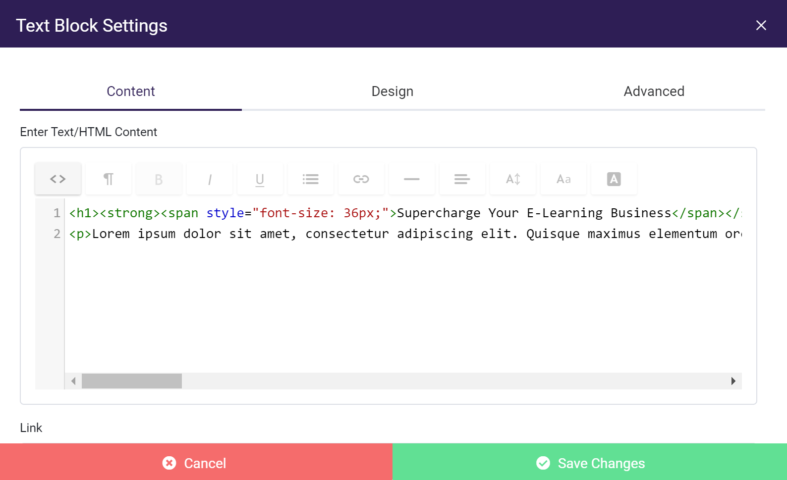
Using the Text Editor
Code Editor
The Code Editor button will toggle between HTML code and the default text editor. Any content created in the default text editor can be viewed as the HTML required to display it on the page, and vice versa. This is useful for those who are used to using and modifying HTML elements and using CSS styling.

Code Editor enabled
Formatting Options
The Formatting button gives you options for formatting your text
Formatting options
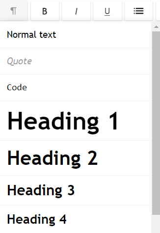
- Normal Text - If any other options are selected, this will revert back to normal text.
- Code - Text will display in Code Editor font
- Quote - Text will be formatted slightly differently for emphasis
- Headings - Headings sizes 1 through 6.
Bold, Italic, and Underline formatting buttons are available from the default text editor,

As well as Content Dividers, Text-Alignment, Font Size, Font Type, and Font Color

Lists
The Lists button gives you the option to display text in an Unordered (bulleted) or Ordered (number) list, as well as the option to Outdent or Indent list items.

Links
Please view guideline for entering URLs.

The Link button will give you the option of adding or removing links from your text content in a variety of ways.
You can click the link button and add your text and URL from the pop up menu, where you can choose if you want the link to open in the current page or a new tab:
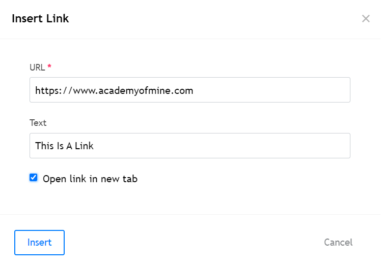
Alternatively, you can highlight text you’ve already typed in the text editor and select the Link button.,This will populate the text in the Link pop-up menu and all you will need to do is add the URL.
Another option for creating a link with text is using the Link Field below the text editor. This will make all the content within a Text/HTML module into a link, with the option of opening it in the same window or a separate window.
Image Block
The Image Block lets you add images to a page or Text/HTML module.
The two main fields in the Content tab of an Image Block are Image Source URL and Image Link.
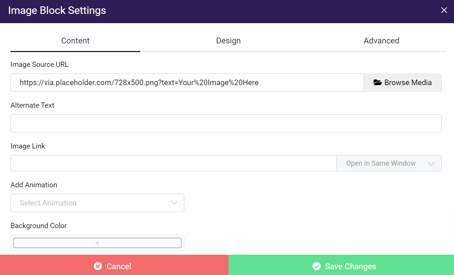
Image Source URL
Gives you the option of using an external URL of an image, selecting an image you have already uploaded to your platform, or uploading a new image within Browse Media.
Image Link
Lets you turn your image into a link to a page you’ve created within your platform or to an external page of your choice, and the added option of opening the link in your current window or a new one.
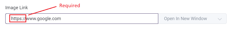
A Note on URLs
When adding a URL make sure to include the https:// or http:// prefix with the address, or your link will not work correctly.
Correct link address:
Video Block
The Video Block allows you to add your own videos to a page or Text/HTML module.
It consists of fields like, the Upload Method, a video source, a Cover Image, background color and Add Animation
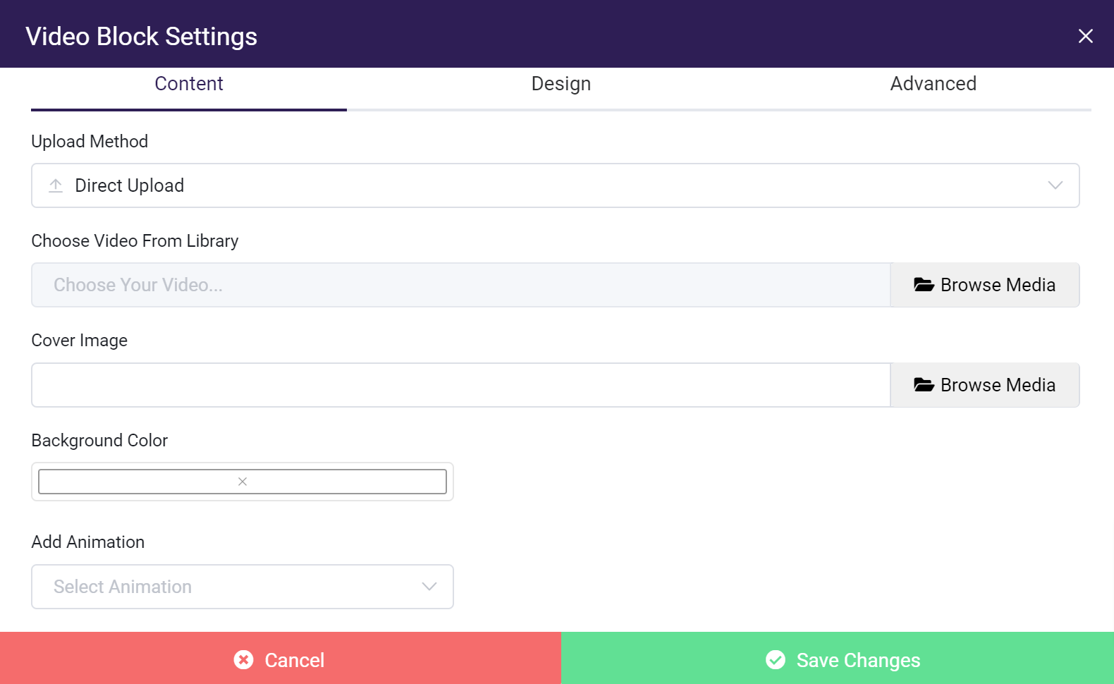
The Upload Method dropdown will determine how you add a video to the block.
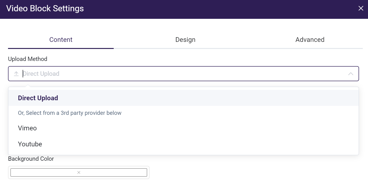
Direct Upload
Choose this option to select a previously uploaded video or upload a new video.
Vimeo / YouTube
Select either of these options to link to an existing video on YouTube or Vimeo.
Please view guideline for entering URLs.
Cover Image
Select a cover image from your Media assets. (If using a YouTube or Vimeo video, the default preview image will be displayed unless another image is manually selected)
PDF Block
The PDF Block lets you embed a PDF document in a Page or Text/HTML Module.
You are provided with multiple options to determine how the PDF is displayed.
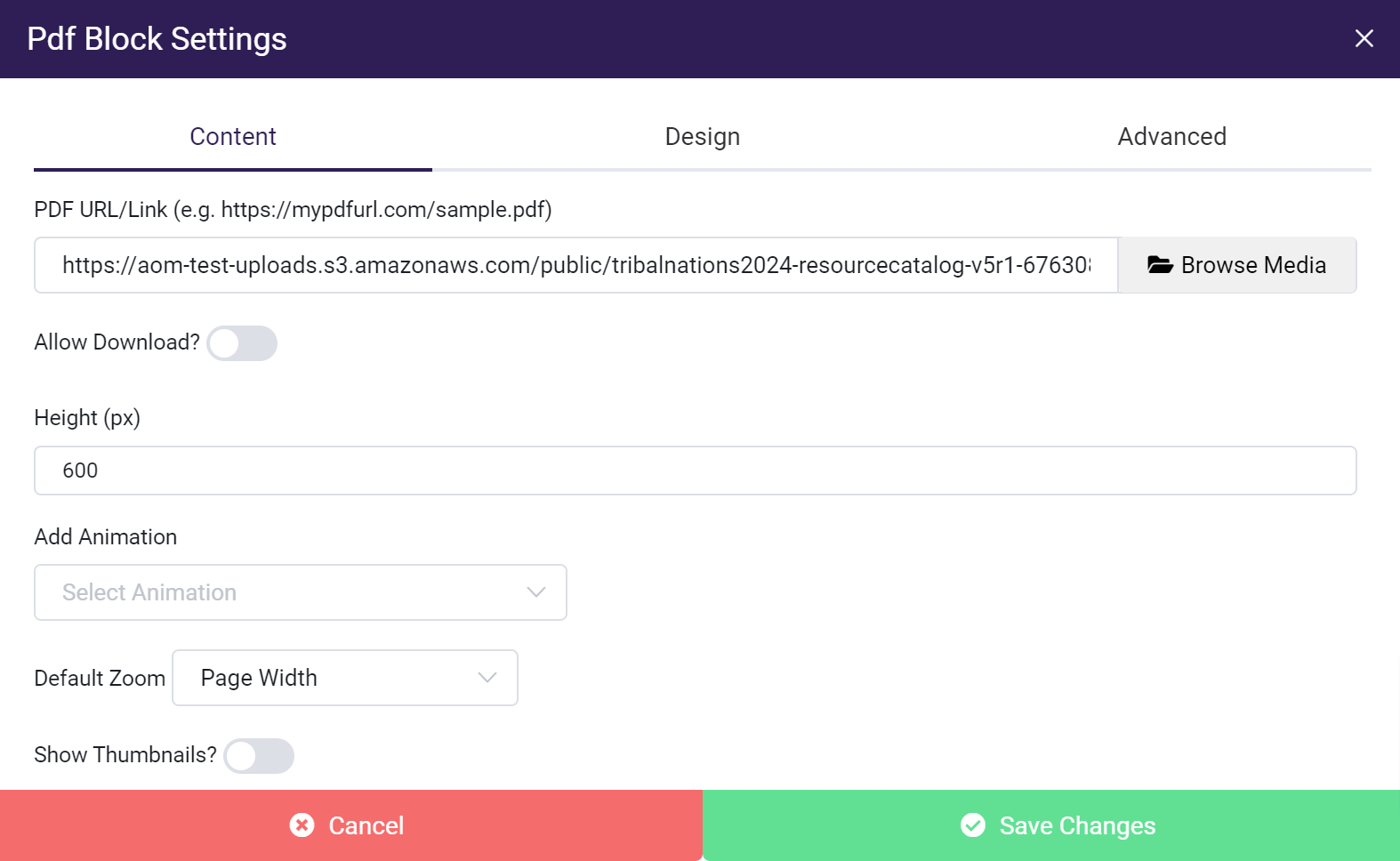
PDF/URL Link
- You can upload your own PDF or include an external link to a PDF.
Allow Download
- Gives a student the option to download a PDF.
Height(px)
- Sets the display height of the PDF on the page in pixels.
Default Zoom
- Sets the default zoom of the PDF when it is displayed on the page.
Show Thumbnails
- Determines if the Previous and Next page preview thumbnails of a PDF are displayed on the left-hand side of the PDF.
Button Block
The Button Block lets you create a button that a student can click within a Page or Text/HTML Module.
You can link to anything, including items for download, internal, or external web pages.
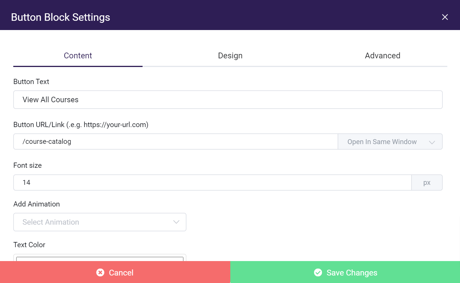
Please view guidelines for entering URLs.
Button Text
- The text is displayed on a button.
Button URL/Link
- The URL you want a button to point to. [URL Hint]
Font Size
- Sets the font size of a button.
Add Animation
- You can select animation for your buttons to make it more visible to users.
Text Color
- Sets the text color of a button.
Background Color
- Sets the background color that the text is displayed on.
Code Block
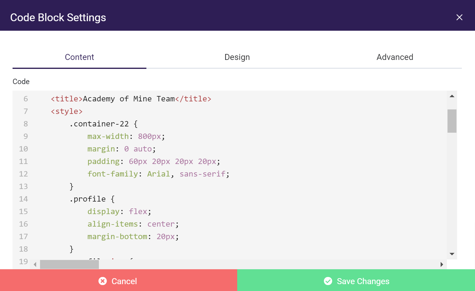
While AOM has multiple ways you can add, style, and modify your content, we also offer Code Blocks in case you want to directly add your own HTML and CSS to a section of your Page.
For example, in the Content tab of the Code Block settings, you can add HTML elements and style them with inline CSS.
Inline CSS Example:
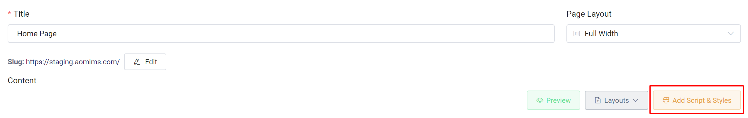
Alternatively, you can add classes to your HTML elements to target them within the Add Script & Styles option.
Click the Add Script & Style button:
Add the CSS with specific class names:
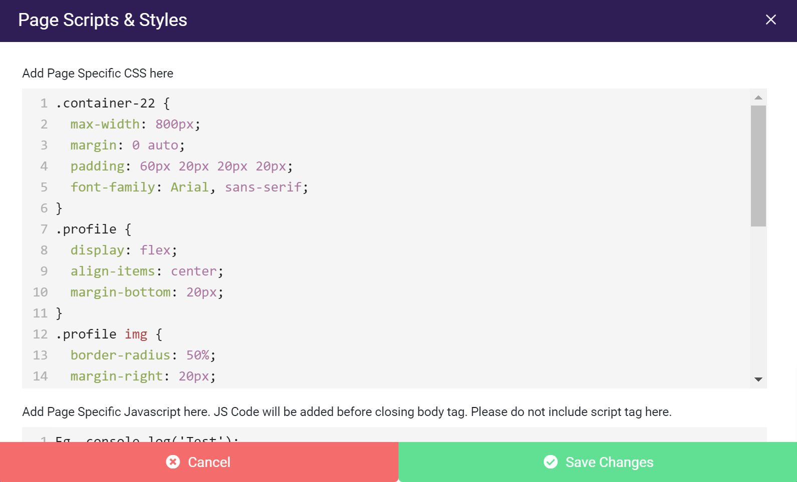
Classes used to target HTML elements
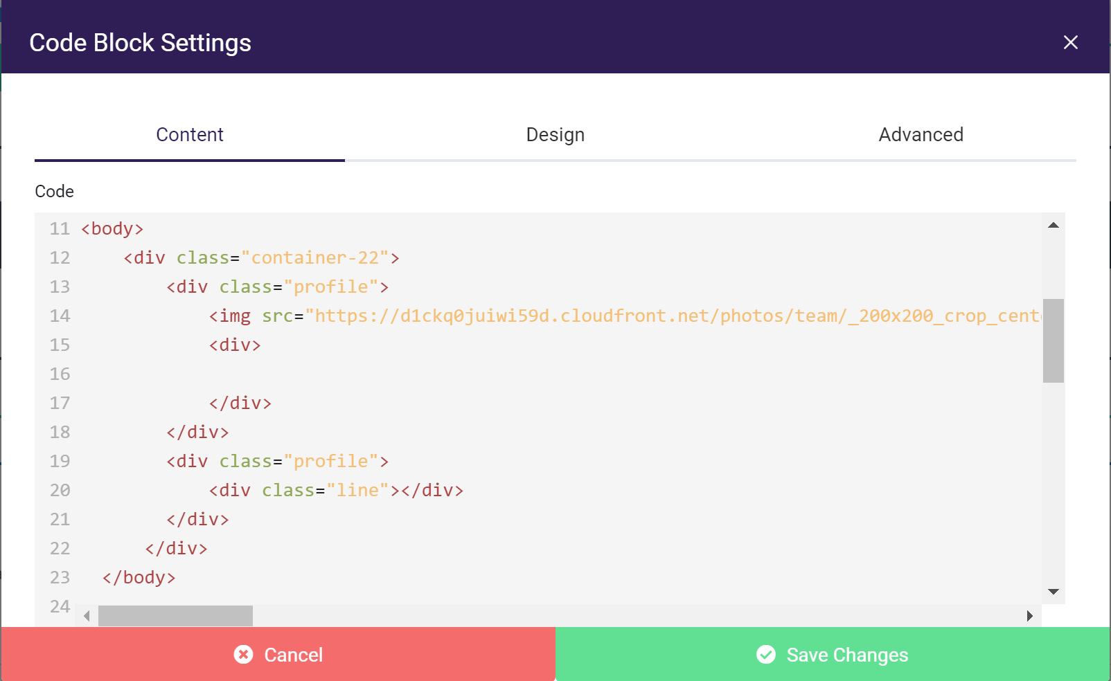
It is important to note that any CSS styling that you modify within a Code Block will be affected by changes made within the Design and Advanced tabs of the Code Block Settings, as well as the Add Script & Styles option in the top right corner of the Page Builder.
There’s much more you can do with a Code Block, including adding images, hyperlinks, and anything else you can think of with HTML and CSS. The options are endless!
Learn more about adding page scripts and styles here:
Adding Page Scripts and Styles
Page Builder-Specific Blocks
The following blocks are only available within the Page Builder.
Contact Form Block
The Contact Form Block gives your customers the ability to provide feedback or request to be contacted.
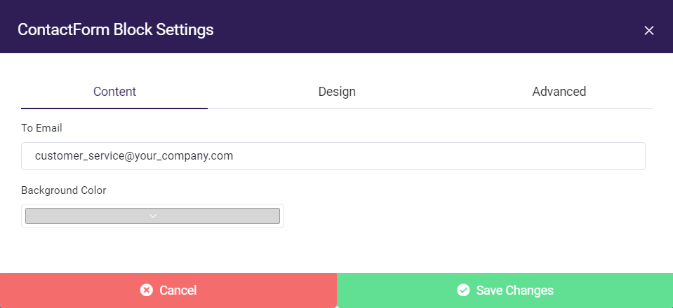
To Email
- The email with which you want to receive customer submissions
Background Color
- The color of your form
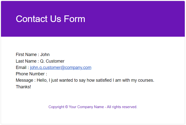
Customer Experience Examples:
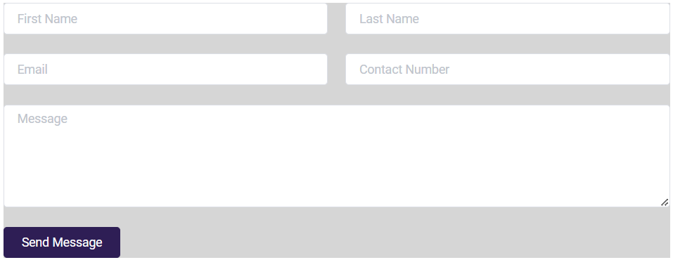
An empty form
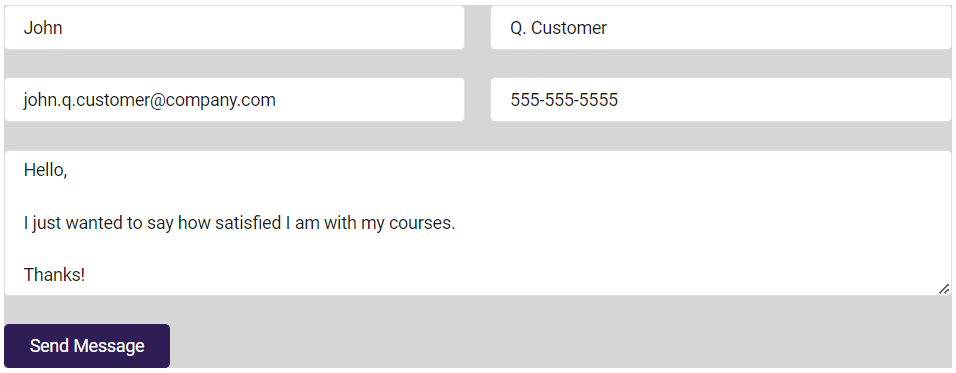
A completed form
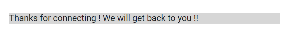
Submission confirmation message
After a client submits their feedback, you will receive a message at your preferred email that looks something like this:
Product Listing Block
The Product Listing Block displays courses that you have published for purchase or self-enrollment. Your Course Catalog page will have a Product Listing Block already set up by default and gives you a variety of options to display your courses. If you choose to create more course Pages, you can use the Product Listing Block to organize them in any way that best suits your needs.
Learn more about the Course Catalog page and listing your products:
- Setting up eCommerce & Creating Products for Self-Enrollment
- Building a Course Catalog
- Creating a Private Course Catalog
- Creating a Custom Course Catalog
- Using Products to Offer Self-Enrollment in Courses
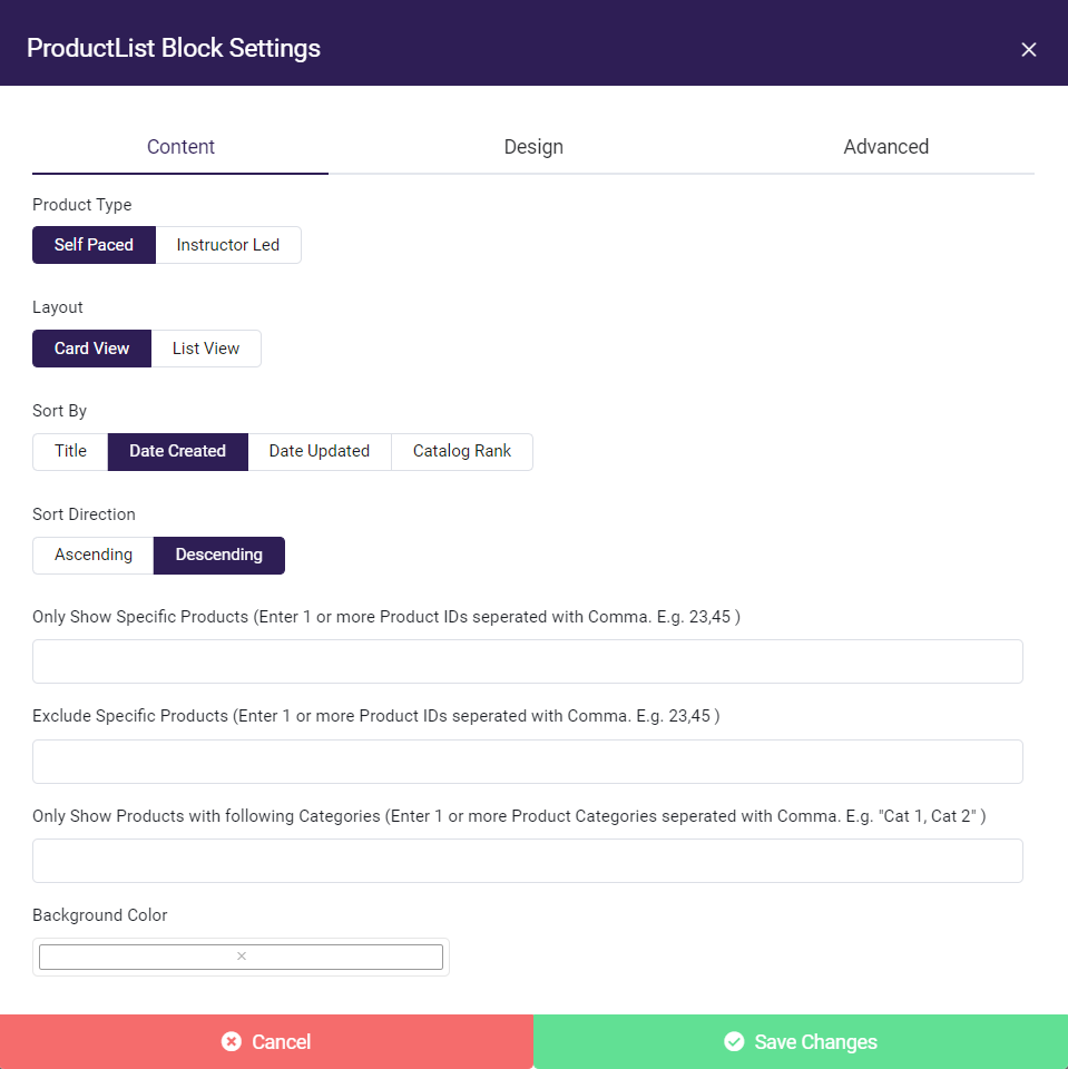
The Product Listing Block
Product Type
Product Type will determine if you are listing Self Paced or live Instructor Led courses
You can learn more about the types of courses here:
Self Paced vs Instructor Led Courses
Layout
Layout will determine how your courses are displayed to students.
Card View will display the Title, Cover Image, and Price of a course. This option gives users the ability to more easily view all the courses you have to offer.
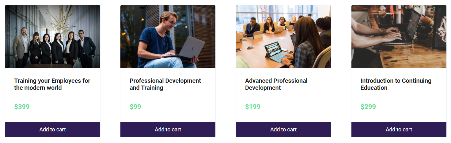
Card View
List View provides users with a more in-depth look at your courses by including their descriptions.
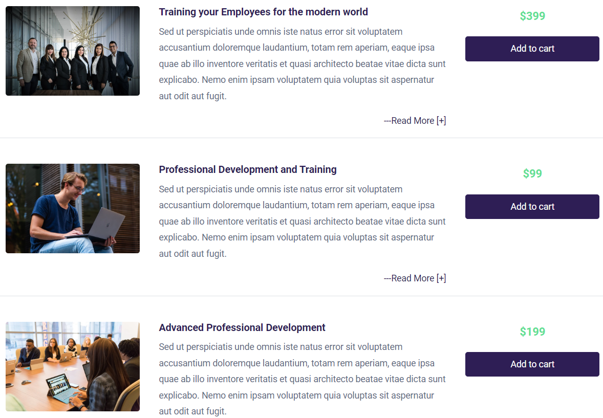
List View
Sort By
- Title
- Date Created
- Date Updated
- Catalog Rank
The Catalog Rank can be set while creating or editing a Product and can be found in the Products page under the E-Commerce tab, with "0" being the highest rank.
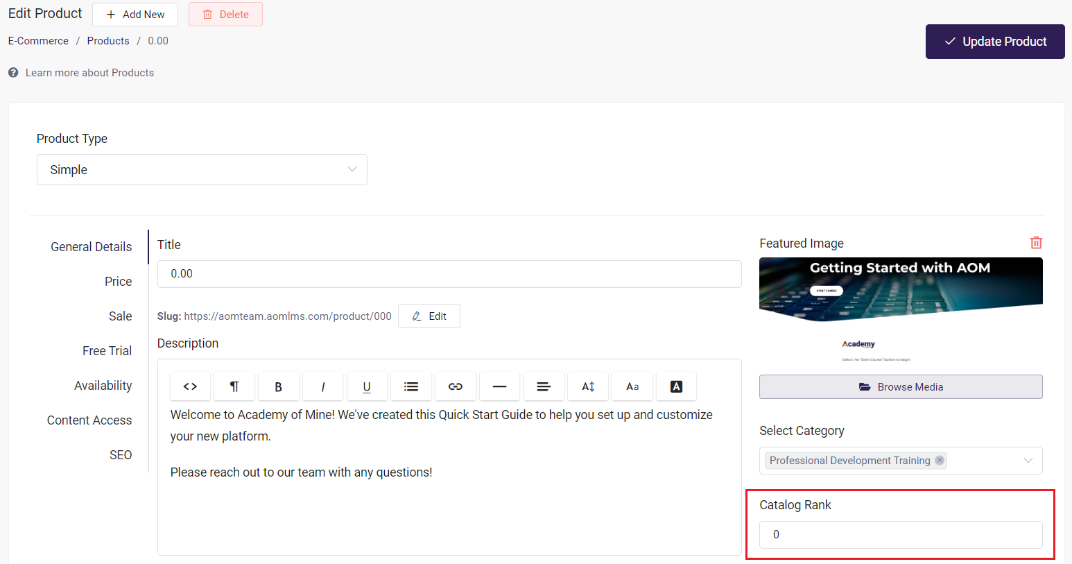
The Catalog Rank field
Sort Direction - This will be affected by what Sort By option you have selected
- Ascending
- Descending
Only Show Specific Products / Exclude Specific Products
These options require you to know the Product ID number if you want to exclude or filter specific products to be displayed. You can find these in the Products page under the E-Commerce tab.
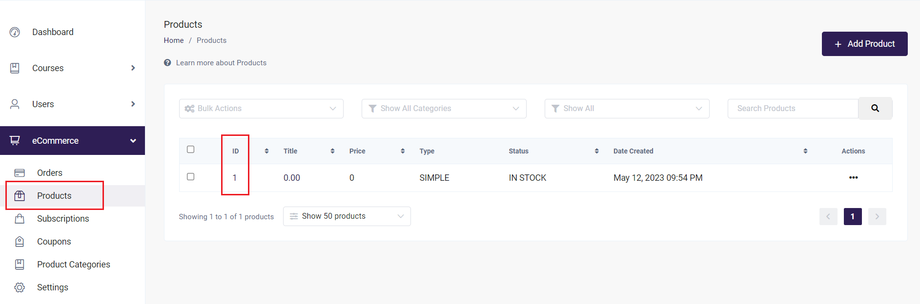
Product ID number
Only Show Products with following Categories
This will only display courses from a Category or Categories you've created previously.
You can learn about grouping Courses together by using Categories here:
Shopping Cart Block and Checkout Block
The Shopping Cart Block and Checkout Block content is not editable, except for their background color. These blocks will update as the user adds courses before checking out.
You can read more about the Shopping Cart and Checkout Process here:
Navigating the Checkout Process
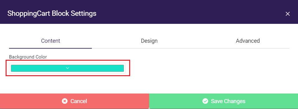
Background color picker
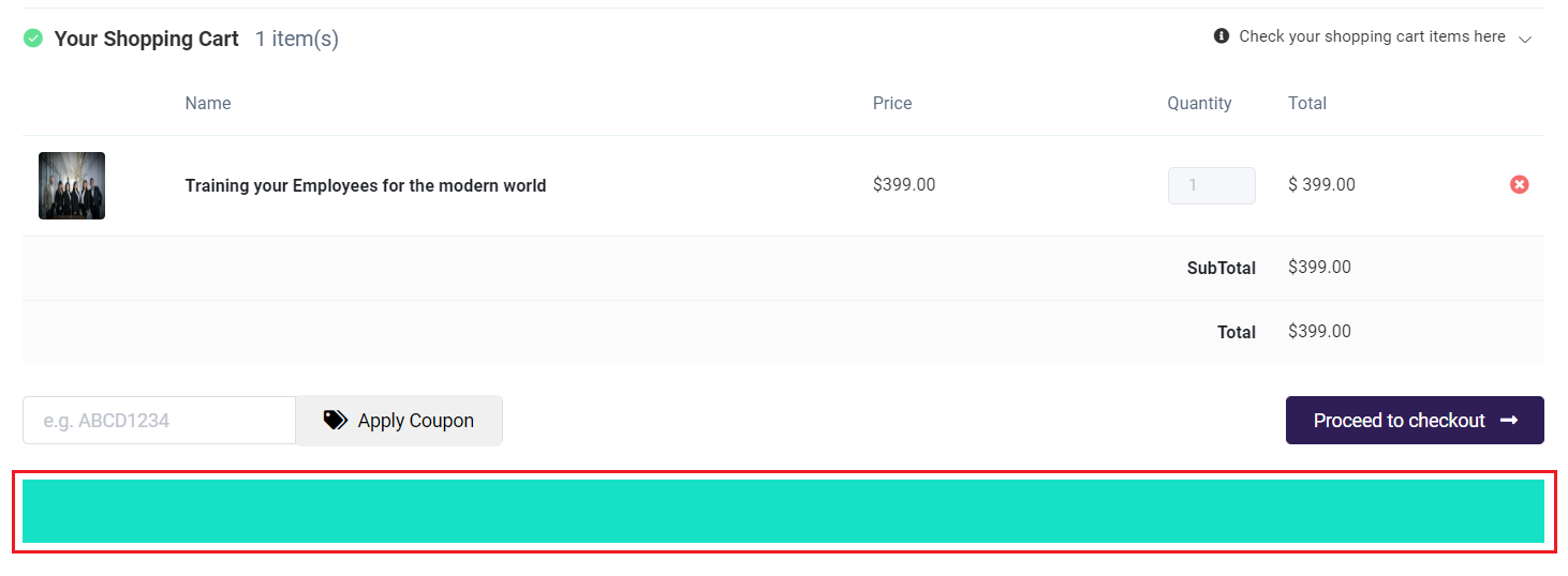
Background color rendered on the page
Adding Page Scripts and Styles
You can further customize your pages using CSS! For those unfamiliar, essentially CSS is what styles and makes up the presentation of the HTML (which is the language that makes up your web page). Each HTML element in a page is wrapped inside a layered box that consists of the margin, border, padding, and content. The margin, border, and padding are aspects that can be changed by adding page-specific CSS to the page script and style. You can also add tracking code and many other custom features. Learn about adding page-specific script here.
If you're familiar with CSS or have someone on your team who knows a thing or two, you can make your desired adjustments by following the steps below:
- From the AOM Dashboard, select the Pages & Menus tab and choose Pages.
- Click on the page you'd like to edit.
- Click Add Script & Styles.
- Add the CSS for that page, and hit Save.
- Then, to add a custom class to a section, row, or block, click the settings for the setting, row, or block, then choose Advanced. Add the class name and save
- Click Save Page.
You can also get a quick overview of how margins, borders, and padding work in this helpful article from Hubspot.